Home » Blog » Minimalist Vs Maximalist Packaging Design

Last Updated on February 25, 2025 by
The packaging never becomes irresistible until or unless you design them to perfection. So, are you a designer, entrepreneur, or vendor selling packaging boxes? The thing is, your products need to be super irresistible for your customers to sell like hotcakes. So, do they have the flare your business needs? If not, or if you want to nail it even more, this is a must-read article you must go through.
So, what do we have here? Actually, you will learn what maximalist and minimalist packages are and why they matter in the era. At the same time, you will find out what makes them special and what top trends are there. Also, you can find out how to enhance their beauty and make things pivot. So, give it a read; you will definitely not regret it!!
Table of Contents
ToggleOne word that comes to mind with minimalistic packaging design is something beautiful and neat in the form of graphics. So, here are some features that minimalism packaging designs offer:
These features make what minimalistic designs are. You can make things special for you, so try them out.
Now, the graphic part of the packaging needs to be a special treat to help you sell. And, when we talk about them, you need to know what your design needs to offer with the visual look. So, here are some new elements that make the graphic part super-impressive:
These elements would definitely help you build a great design that improves your overall look. So, the better you utilize them, the more stylistically sound your boxes will look.
One of the main reasons to use such elements is to make things ridiculously easy to understand at first sight. So, you need them when your customers like such designs, and they need instant communication about products. This is why one thing to remember is to realize what your customers want from your side.
Now, what you get from such designs means a lot to your business. Your designs carry that hip feel that also looks decent and super neat. Any audience that likes the products’ neatness would love having such packaging graphics. So, look for that urge in them, and if you find that, try a nice one out.
Now, the whole box design of your packages can be a real help you would need. So, here are some other aspects you need to know:
So, here are some benefits you can get when you use minimalism in your packaging. Now, we will discuss what maximalism is and how it can provide you with solutions.
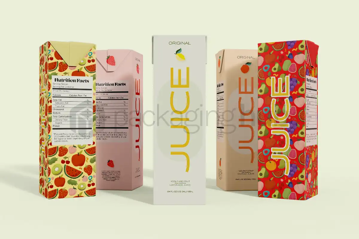
When it comes to the design and color selection, both types work impressively well in vibrance. The main feature of the maximalist approach is that you can cover the whole product with color. At the same time, your design may take care of the whole package by covering the main focal points.
The thing is, such styles look impressive with vibrancy in colors, which makes them similar in outlook to minimalistic ones. At the same time, you convey what your brand is about and how it can impact your audience’s lifestyle. You try to incorporate your brand’s values and perfect the brand voice you want to deliver.
Knowing your element, your packaging design in maximalism is where the real game is. The thing is, if you want to make it bold, and need to learn about what elements to use and where to use them for clear success. So, here are some symmetries and design beauties such graphics would carry:
Multiple other trends have been bringing success to brands. So, try any of these ideas to execute them into perfect packages.
Like the counterpart, this design type would get you amazing attention. Also, adding a flare of vibrancy and beauty that stands out is what they can deliver. Plus, you make a clear style statement for customers that would buy it. Finally, using them for unboxing experiences can help your product be that special unicorn in the crowd of content online.
So, the bottom line here is you can make things pivot with them in front of your audience. Another thing to remember is you can improve your packing outlook on the loudness you create with them. So, they do stand out and represent your brand differently. This way, you make things impact and bold.
So, now we know how these two lovely extremes can make your design graphics and, in one case, the boxes special. The main differences and takeaways from them are these:
Whether it be minimal packaging designs or maximalist ones, using a perfect graphical and box idea is what you need. So, minimal packaging can perfectly solve your beauty needs. Packaging Hub has every tool, experience, and expertise to help you get more sales. Looking for any of either styles? We can give you the perfection your designs can use.

Order your stylish and durable custom boxes and packaging from a team of industry experts.